Trying to create your own menu can seem like a daunting task, but don’t let it scare you!
I’m going to show you in this post how you can easily use Microsoft Publisher to create a restaurant menu. As you begin to take control of your own marketing you can also use the program to create other items like flyers and posters.
I like this program because it is simple to use and integrate with other Office programs. I started designing our marketing materials with this program and then switched to Adobe when I was looking for a little more functionality.
However, there are still certain items that I use Publisher for, like when we do mail merges.
Use A Template For Your Menu
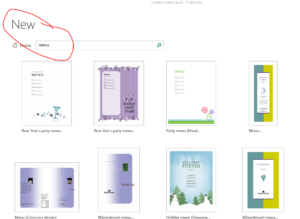
The easiest way to create your restaurant menu with this program is to use one of their templates. When you go to open a new document there is a search bar where you can search their database for templates.
If you type in menu or ‘restaurant menu’ you will have several options to choose from. The only problem is, the theme might not go with your restaurant or logo. But it will be very simple to create.
When you find one that you like, or at least can live with, select it and click the create button. The template will then download and you are free to change it as you see fit.
The template should be pre-loaded with text boxes that you can edit with your actual menu items.
I’m going to get into more detail in the sections below on how to actually make changes in the program so if you do decide to use a template be sure to check out the remaining sections so you can learn how to edit it.
Build Your Own – Pick A size
Congratulations! You decided to take it a step further and design your own restaurant menu with Publisher.
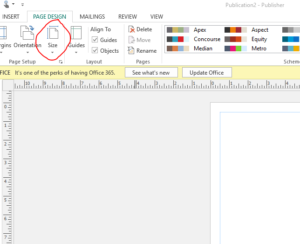
The first thing you will need to do is open a new document. It will ask you what size you want, for this example I’m just going to use a standard sheet of paper 8.5” x 11”.
Don’t worry it is easy to change the page size once you have the document open.
For this example we are going to created two-sided menu so the first thing I’m going to do is right click on the blank page and click ‘insert duplicate page’
Now you have your front and back pages established.
Design the Layout
Now you should start planning the different sections of your menu. If you already know what you want it to look like then go ahead and start sketching your menu out on a blank sheet of paper. This will help you move through the design process more efficiently.
If you don’t know what you want, I would recommend doing a quick google search for restaurant menus and clicking on images. You should easily be able to find one that you like.
Don’t spend too much time on this as since you own the program you can revise the menu as much as you like.
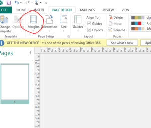
The next thing we need to look at our margins. You should set the margins to .125”. To change the margin click on the page design tab then margins and you will need to select custom margins and individually change each one.
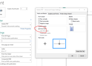
If you want to have an image or color run all the way to the edge of the page then you will need to print crop marks which you can set in the printing options. In printer’s term this is called a bleed.
From the drop down to select a printer choose ‘Advanced Output Settings’ and make sure crop marks is selected.
Basically they have to print on a larger size paper and then cut it to the correct size. This is more expensive but I personally think it looks great. It is more expensive so keep that in mind.
So, whether or not you decide to use a bleed you should keep all of your text boxes and logos inside these margins.
==>Find Out More About Your 30 Day Free Trial<==
Insert Your Logo on Your Menu
Now that we have the pages setup, let’s start by adding your logo at the top.
- Click on the Insert Tab
- Select Pictures
- Find your logo on your computer and click insert
- Resize and position your logo where you would like it
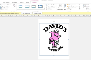
As you can see when I insert our logo here it covers the whole page and the bounding box doesn’t quite fit, there some empty space.
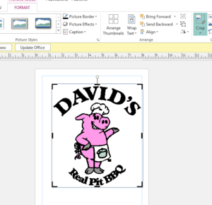
I am going to use the crop feature to reset the box so that I can then resize the whole image. When you insert the image it should automatically pull up the ‘Format’ tab where you will find the crop section.
Next I will the re-sized bounding box to re-size the actual image. When you click on it each corner will have a button that you can click and drag to resize. The round buttons will keep the ratio the same but if you drag by the squares it will only adjust that dimension (length or width)
When you have the size you like simply drag the whole image to the top right onto your margin guideline.
I’m then going to use the “align” feature to center the image. Depending on your logo you may choose to have it aligned to the right or left, which you can use the align feature for that or simply drag it over to your margin guides.
Add Text Boxes
You can now begin to build out the rest of your menu with text boxes. Go back to the ‘Insert’ tab and select ‘Draw Text Box’.
Feel free to make them whatever size you like! There will be a guide on the ruler so you can make them exactly the size you want. Don’t worry too much though you can resize them even after you add your text.
Fill them up with your menu items, be sure to add a delicious description and the price. This is where having the sketch of what your menu will help you move through this part faster.
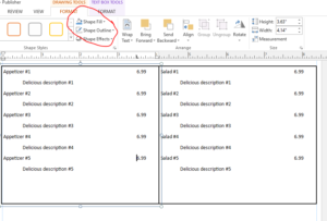
Once you have your menu items neatly typed in the text box, one thing I like to do is add a border to the text box to give the menu some definition.
To do this simply select the text box you wish to edit and click on the ‘drawing tools’ format tab. There you will see options for shape outline or fill if you wanted to add color inside the text box.
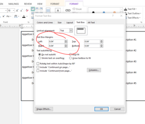
If you feel like the text is too close to the edge of the text box right click on it and select “format text box”. On the text box tab you change the text box margins which will push your text away from the edges if you increase them.
There are hundreds of options to play with so feel free to experiment with different styles until you find one you like. Don’t get overwhelmed though, just pick one!
Add Titles with WordArt
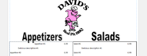
Publisher has a neat tool called WordArt. I like to use this to add titles to your restaurant menu item sections.
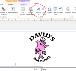
Click on the ‘insert’ table and select WordArt. Choose your favorite style and enter your text. Don’t worry you can edit the colors and styles of the WordArt from the format tab.
Add Images
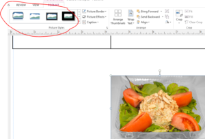
Now I want to show you how to add some images. It is just like when we added your logo but let’s add some borders to them and make them look a little nicer.
Simply select a style that you like and then you can use the other format tools to play with the options.
You can really spend as much or as little time as you want designing your menu with Publisher. You will get out of it what you put into it.
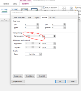
One cool trick you can do with the pictures is play with the transparency. This is helpful if you want to put it behind the text, increasing the transparency will help your customers read the menu better.
Simply right click on the picture and select ‘Format Picture’, in the ‘Picture’ box you will see these settings.
Finish It
At this point you should have the basics down to complete your menu. Go ahead and fill out the second page if necessary and get that thing printed!
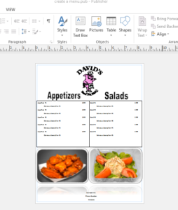
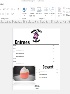
Here is the final product.
I only spent about 10 minutes on this so I expect yours to look much better. But at least you now have a foundation you can start building on.
Play with the fonts, the colors, the different styles. Maybe search for a free texture image to put behind all of your text to really give it some depth.
The possibilities are endless.
Conclusion
After reading this post you should be able to:
- Open a new Publisher document
- Create multiple pages within the document
- Re-size pages and adjust margins
- Add textboxes
- Add titles using WordArt
- Add images such as your logo and food with borders.
These are the basic building blocks for using Microsoft Publisher to create a restaurant menu. There is a lot more you can do with this program but take it one step at a time.
Plus, they offer 30 day free trial so what are you waiting for? That is plenty of time to create several menus!


Dear nextlevelconsultants,
Thank you for this step-by-step guide! My parents have been brainstorming ideas for a healthy fast food restaurant they want to open up. I think Microsoft Publisher is perfect for creating the menu easily and simply. I look forward to your next post. Cheers~
Hi Grace, yes Publisher would be great for them. I know they would easily be able to create a menu with it.
Hi Jeremy, what an excellent post. When I learn something new, especially when it’s technology related, I love detailed explanations with diagrams of how things will look at each stage. You have made everything so clear and easy to follow, it’s perfect. A long time ago I worked in the banqueting department of a well known hotel chain, and we used to create menus, and brainstorm interesting names for the dishes. The one thing we could have used was Publisher to make our menus look a lot better than they did. My how technology has changed!!
Awesome! I’m glad you found this description of Publisher useful, thanks Hindy
As someone who also does website design and development, I found this information to be extremely helpful, practical and useful. I appreciate you putting it out there step-by-step because it is so easy to follow. Thanks and all the best!
I’m glad you found the post useful Howie, thanks!